If you've ever spent any time around safety engineers, you'll know that they love their analyses. A good engineer can rattle off a dozen acronyms for the various ways of disecting information -- a PHA, FMEA, CCFA, PRA, etc... There are literally books with tables in them listing the plethora of options available.
 You thought I was kidding.
But the problem I've always had is that these analyses are either:
- too process heavy,
- not visual enough, or
- require special tools
I'm a visual thinker and I don't like remembering a million steps or using specialized tools. I need something simple and effective. Enter the FlowBone Diagram.
What's a FlowBone?
A FlowBone is a flowchart you draw to help you figure out the root cause of a problem. It's a a cross between "5 Why's" and a classic Fishbone Diagram, but it's my favorite because it's easy to follow (like a fishbone), has space for including notes (like 5Y's), includes color as an additional dimension of information, and doesn't require anything special to create.
 A full-blown FlowBone
How does it work?
To make a FlowBone, all you do is make a flowchart where everything is connected by "why". Start with the observed problem and work your way down. Add colors as you see fit.
There's no special software required -- anything that can make a flowchart can be used to make this. In my work I've used the Confluence plugin Gliffy, but really anything will do.
Tips for a smooth FlowBone
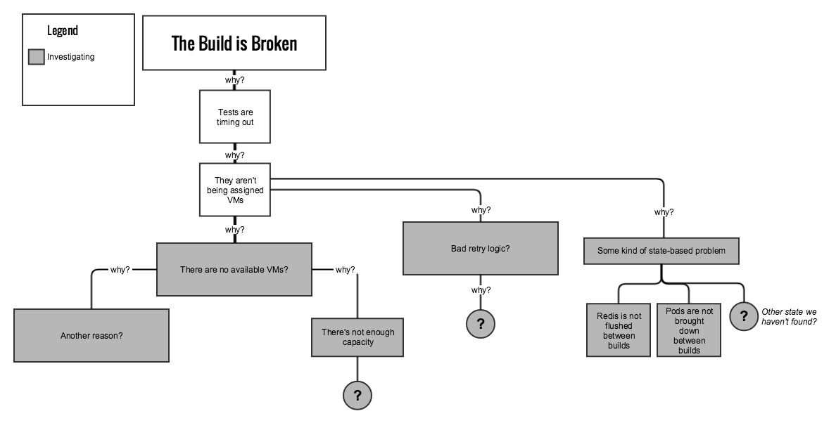
When you first start a root cause analysis, there's going to be way more questions than answers. So I suggest starting with 2 colors -- white and grey. White boxes are things you're certain of, Grey are things under investigation.
Lots of work to do.
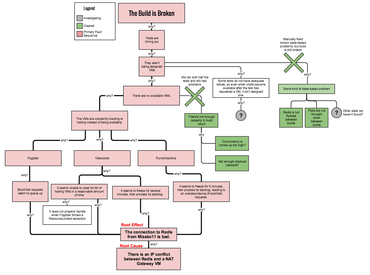
As you make progress in the investigation, certain paths may become ruled out. Keep them on the graph, but mark them as "cleared" and put notes explaining why.
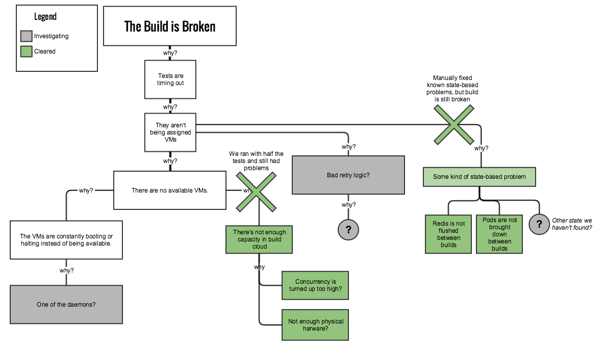 The X's are optional, but after hours investigating a dead-end you'll want the satisfaction of placing them.
Eventually you may reach a point where several items may point to a possible common cause. Focus your efforts here. This is the biggest advantage that a visual layout can give -- directing the investigation toward meaningful common-cause paths.
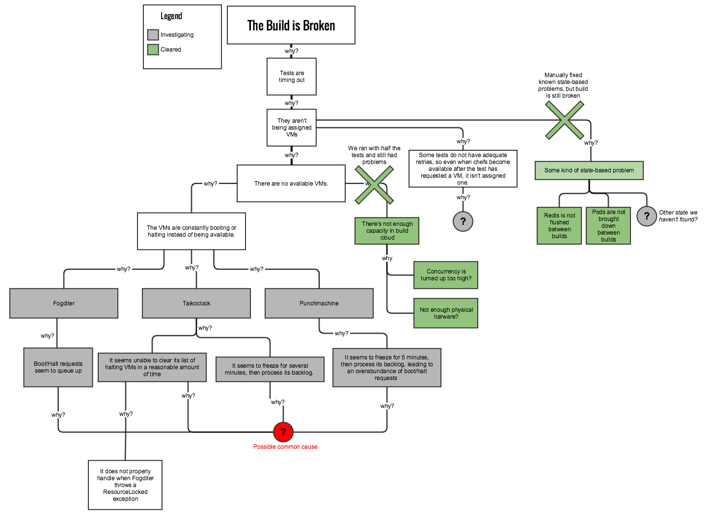 Zeroing in.
When you've finally narrowed down the root cause, a little visual sugar can make it a great report. You can link boxes to work tickets, highlight the fault path(s), add labels, etc... Do whatever makes sense. The world is your oyster.
This oyster cost us several days of downtime.
And that's the FlowBone.
If you found this article useful, please drop me a line and let me know.